AGRUSTIC SOMNACUNI
|| ROMANY ||
CRADLE || LET US PRAISE
THE ROM || CHUPPA || MEDIATHECA 'FIORETTA
MAZZEI' || 'ENGLISH'
CEMETERY || AUREO
ANELLO || Blog on 'From
Graves to Cradles', etc. Hebe
Wilcock/ Daniel-Claudiu Dumitrescu/ Julia Bolton Holloway
© 2017
STONE LETTERING
HEBE
WILCOCK
I invited my
friend's twin daughters, Hebe and Alice, to come to Florence to
teach our Alphabet School how to cut letters in stone so these
could be used in our Swiss-owned, so-called 'English' Cemetery.
Daniel-Claudiu Dumitrescu asked also for written instructions,
for a manual, that he and you could consult. This is what Hebe
wrote:
LETTERCUTTING
Before you begin
- Check tools
are clean and sharp
- You'll need:
- pencil
- fine sand
paper
- ruler
- set square
triangle
- chisels
- mallet
- easel (with
g-clamp to hold stone if necessary)
- protective
clothing
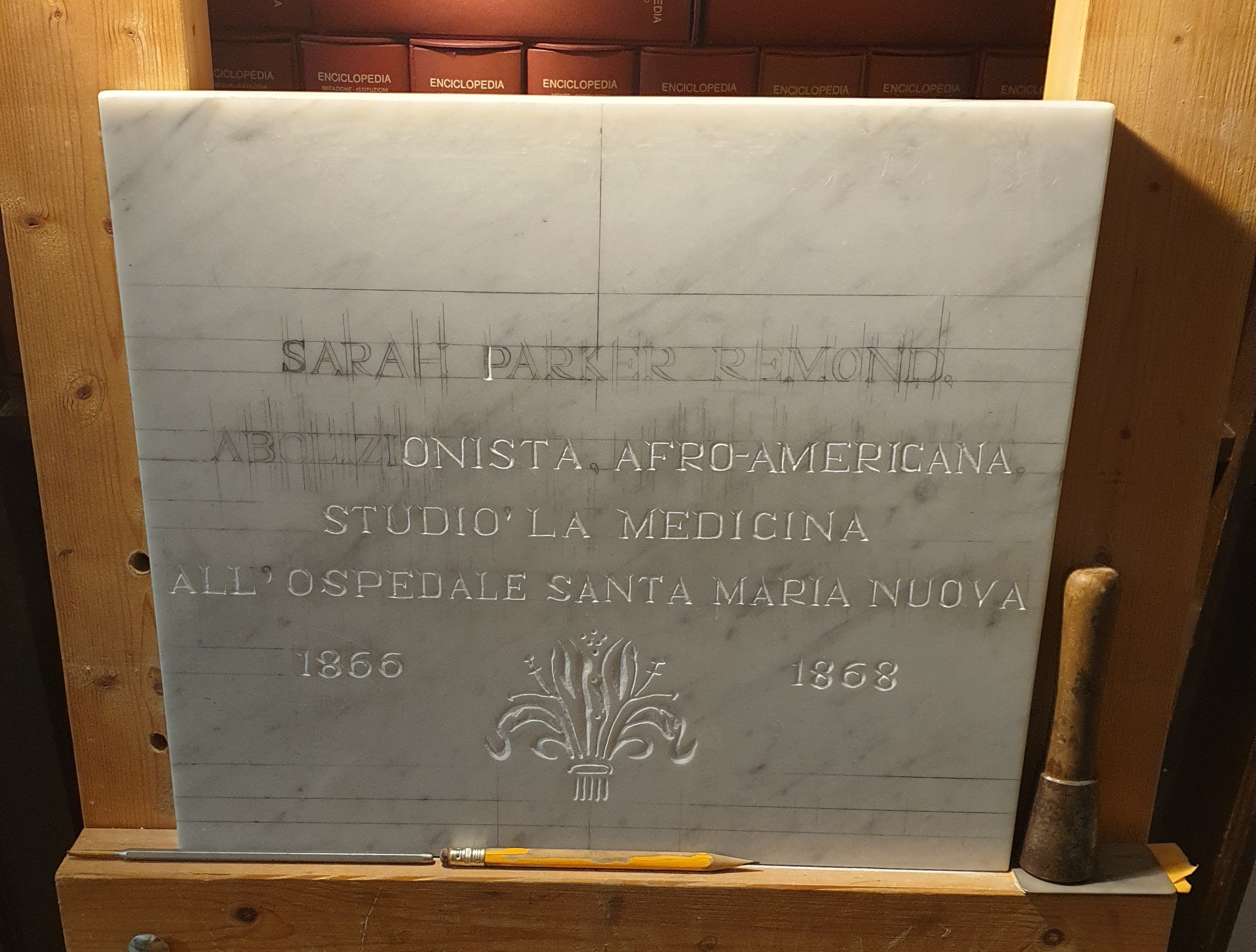
Start by drawing
your desired inscription onto your (clean) stone. Make sure that
you've rubbed the surface smooth (if it isn't already so).
Use the triangle to check that your letters are upright and the
ruler to check that your letters are a consistent size. Also the
spaces between each letter should look consistent (I'll talk
about this more.)
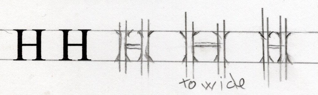
When you and your client are both happy with the proposed
lay-out of the inscription, then you are free to start cutting.
Start by cutting the skeleton of the letter, stopping before you
get to the top and bottom.
K 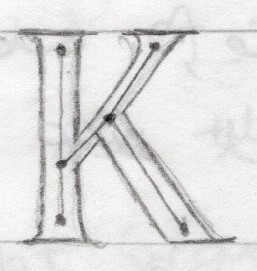
You should be holding the chisel with your left hand. You
generally cut from bottom to top and from right to left so you
can always see what you're cutting.
Decide which 'Stroke' you want to cut first.
A 'Stroke' is from when you wrote with a brush or pen. If you
have a thin Stroke, start with that
K
For example
Start with the sideways Strokes, going into the upright stroke.
Cut the serif of your thin stroke first.
How to cut a serif.
Lightly cut the outside edge of the serif.
A serif can look different depending on what style of letter you
are cutting. So make sure you've studied and drawn what you want
if you are doing it to match a previous inscription.
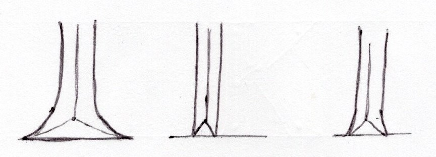
Once you have cut the serif, widen your skeleton line into a
'v'. Remember to cut each side of the 'v' a bit one side then
gradually widening it up to the drawn edges. Take your time.
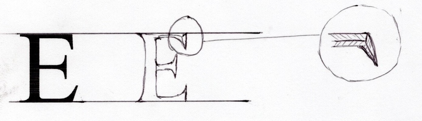
Cut all the thin Strokes first before your thicker Strokes, and
slow down, cutting more carefully where Strokes bisect, the
corners are weaker
For example:

When cutting, try to keep the middle of the 'v' a consistent
depth, and nice and straight. Visually it is the line of the
skeleton. You want your letters to have good posture!
Three ways of cutting
1. Stabbing.
This is quick, but less subtle. Hold the chisel flat on the
stone, angled slightly out each side of the 'v'.
2. Chasing
This is the traditional way and requires most patience and
skill. You run the chisel up each side of the 'v' gradually
shaping it. You have to do this with curved shapes, and it is
also the best way to tidy up a letter.
3. Chopping
I like this way for getting out stone quickly but with more
control than stabbing. It is sort of half stabbing, half
chasing.
Do quick little stabs, pointing the chisel in at an angle,
moving up the edge of your outline.
When you've done both sides, there will be a zigzag shape of
stone in the middle. You can chase up it to 'clear out' the
middle, making a straight skeleton line
Things to remember
* Your lettering will look much neater if you keep within your
ruled lines. The only exceptions are.
The point on an 'A' and an 'N' can slightly go over
This should be subtle though, lightly skimming your top line
* If in doubt, stop and think. As Ted used to say (my old
teacher) 'You can take it off, but you can't put it back on
again'.
So don't cut more and more if it's going wrong. You can always
go back to it later.
* Mistakes happen, even if you've been cutting for years.
Sometimes there can be a flaw in the stone, that you don't know
is there 'til you cut it. Don't give yourself a hard time if
it's not perfect, that's what gives it life.
* Finally a word on spacing.
This is relevant for when you are drawing an inscription.
Give your letters room to breathe, personal space, but don't let
them float so far apart that words are broken. Serifs of two
uprights should stand near each other, but not touch
If you have an angled letter, the serifs can just touch.
HN 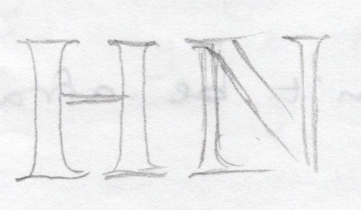
A curved letter can come a little nearer than an upright to
another upright and nearer still to another curve and an angled
letter.
AD 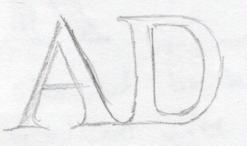
Above all, you want consistency of space. Learn to look at the
spaces between letters as areas rather than measurements between
outer edges.
Trust your judgment, try to get the shapes to look balanced.
Very last of all, it's best to cut when you're not angry, hungry
or in a rush. You're more likely to make a mistake. Stone
requires you to be measured and patient. I think of stone as
living with a slower heartbeat.
Good luck, enjoy it and don't be afraid to try.


![]()